7 Cedars Medley
An assortment of projects that I found of particular challenge, interest, or product.
Working on many different dining, entertainment, and gaming promotions during my time at 7 Cedars Casino, I figured I should make a place for all of my favorite misfits that didn't quite have a larger, more involved project worth highlighting independently. Here you'll have a chance to see a larger scope of the works I did as a designer on the Marketing team and how I used different tools to create more unique and tailored graphics than from our Shutterstock pool.
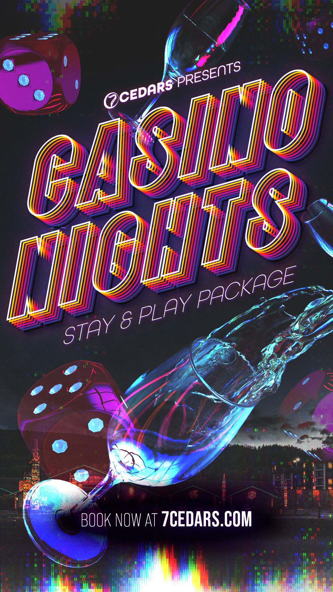
Casino Nights Hotel Package
The top-selling package with the hotel, it combined all of the good fun and excitement of enjoying a hotel stay with an attached casino. Taking that prompt, I styled my design with after a party-hard-at-all-hours theme featuring a dark "nighttime" background and bright colors like the neon lights that flash outside the holes-in-the-wall that say "I'm a bad idea, but a fun idea." Utilizing 3D models imported into Adobe Dimensions, I crafted my own scene of throwing dice and drinks and a little screen glitch to communicate a wild time awaits with wins and wines.
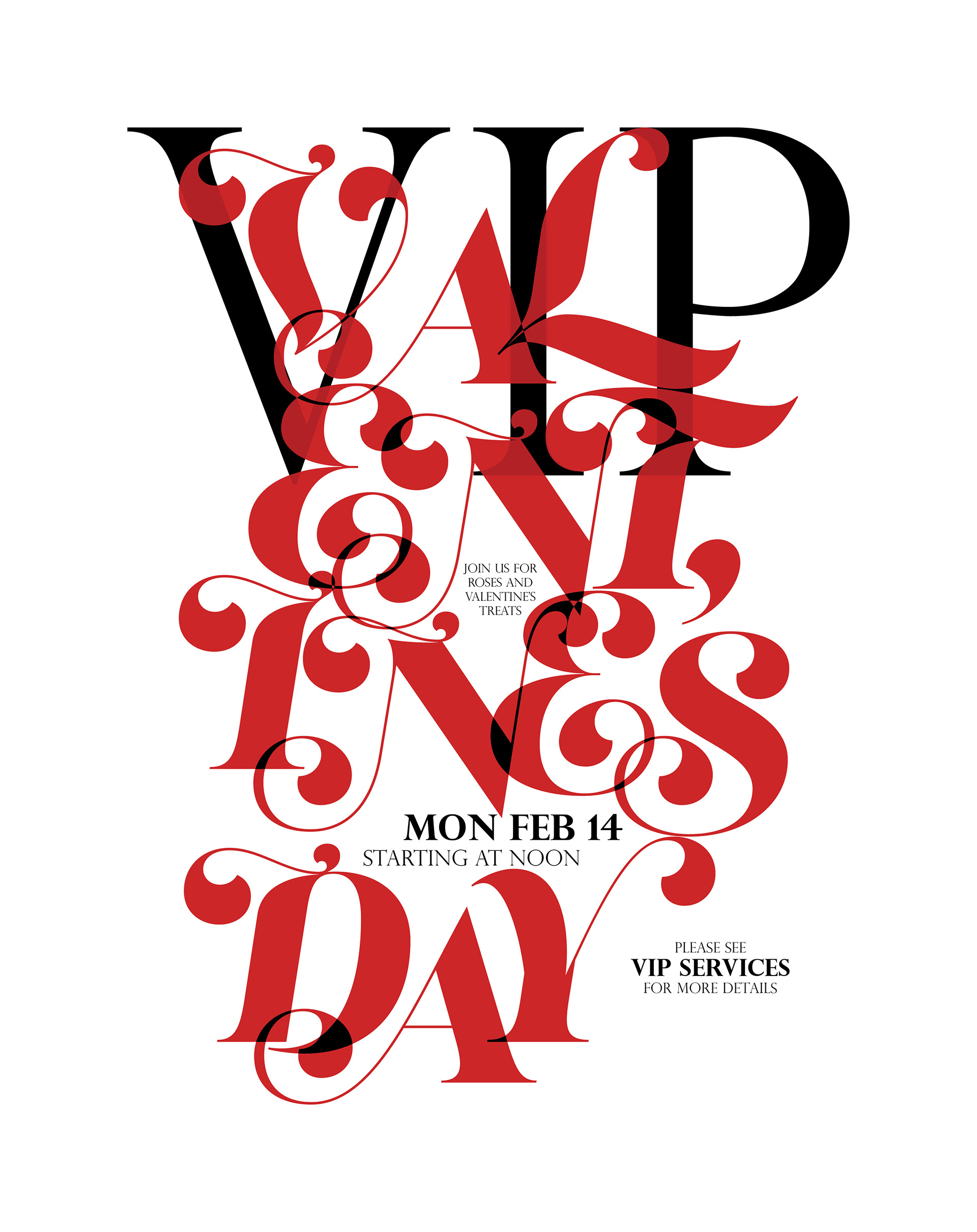
Valentine's Day VIP Party
For the holidays, Totem Rewards VIP Services would host a party for the top earners, and needed a poster to put outside their offices to advertise to the players on-site. This was not my picked concept as it was "illegible to the layman." Typically these are throwaway projects, but I decided to play with more type abstraction and minimizing the stereotypical Valentine's day hearts, roses, and such.
However, that being said, I wanted to preserve some elements of those aesthetics, particularly with the roses, which led me to the Lust font and it's flowery accents. This was also a chance to depart from the rigid text alignment center, left, and right and play with the negative space left between the different characters.
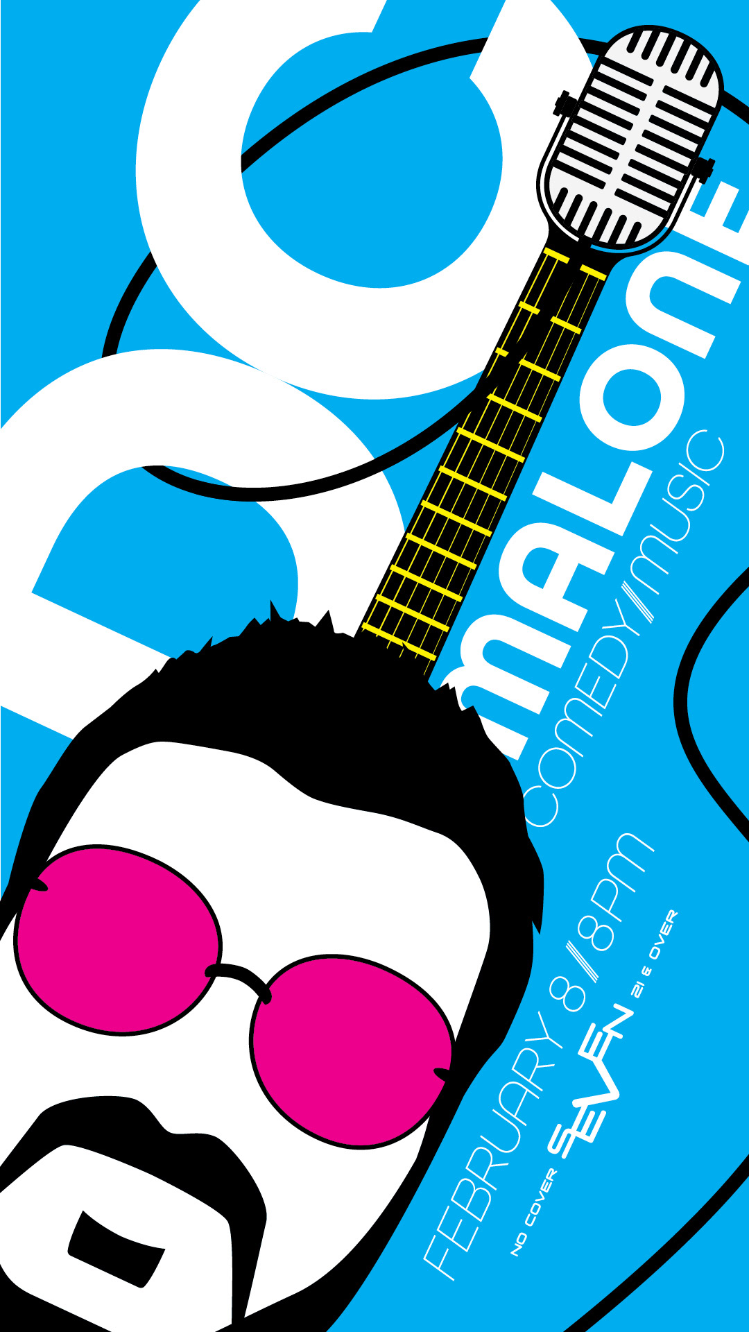
DC Malone Performance
Inspired by the comedic and rhythmic stylings of this comic/musician act, I thought there had to be a tongue-in-cheek sort of way to illustrate the two. And voila: the DC guitar with microphone head and head body. I colored this in CMYK for the pleasure of my additive-process print fanatic Art Director. We were later told that Malone too found it amusing.
Like his act or not, he's a pretty standup kind of guy.
[INSERT RIMSHOT]
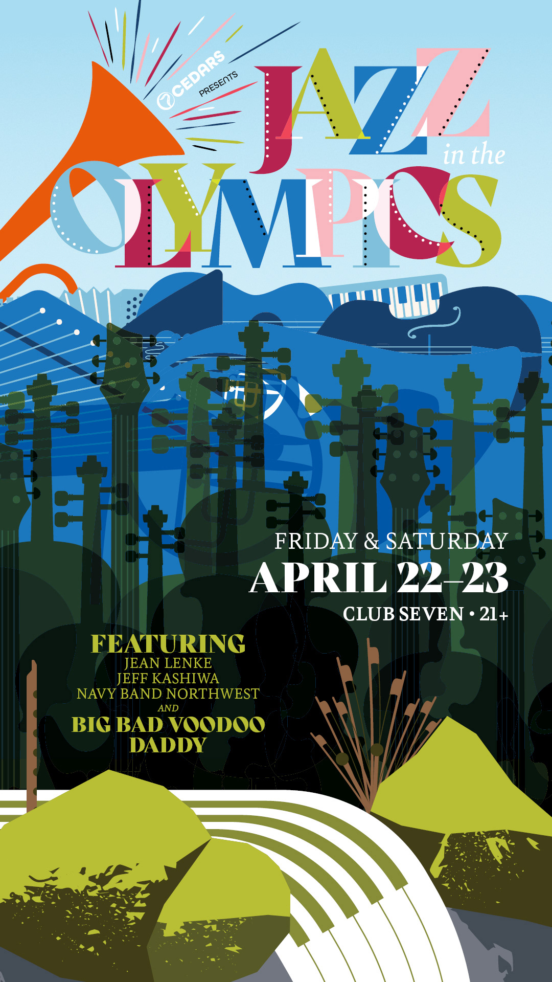
Jazz in the Olympics Festival
With a particular fancy for jazz, I went on a wormhole of finding inspiration from previous festival posters across the decades and the world. Many showed that color and abstractions of instruments and players were key elements to derive my work from. All that was left was to anchor the design to the Olympic Peninsula, so I sourced colors from some of my photos of the Olympic National Park and their elements to build a natural scene from different vector instruments. From a mossy-rocked stream in the foreground, to a cello and guitar forest, and a mountainous landscape of piled instruments in a vague shape of the Olympic Mountains, I crafted a scene that Mary Blair might've been proud of.
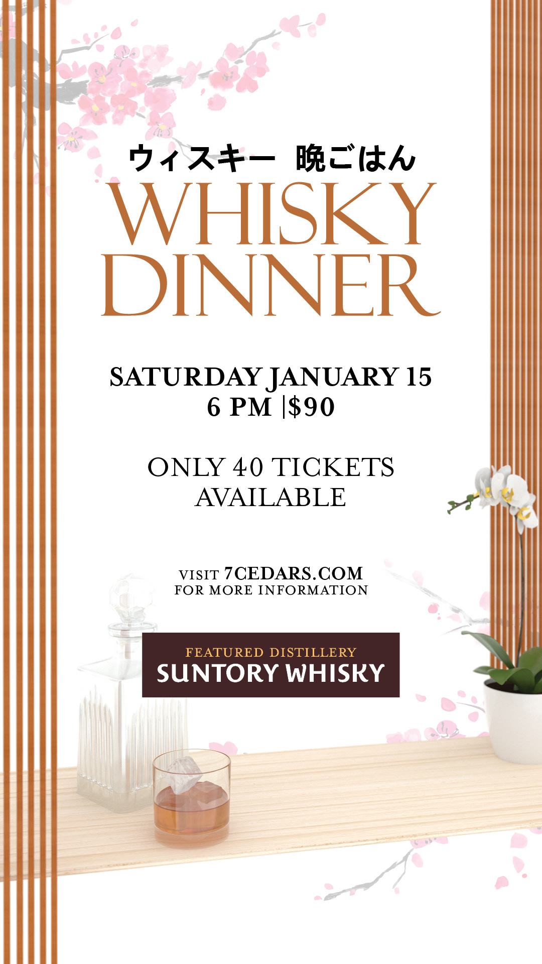
Whisky Dinner Pairing Dinner
In 2021, we had the privilege of hosting a whisky pairing dinner featuring the famed Japanese distillery Suntory Whisky. As one of Japan's oldest distilleries, it is steeped in rich heritage that began at the turn of the 20th century.
Sampling elements of traditional Japanese arts and minimalist design, I setup a scene in Adobe Dimensions with various 3D models to get the setting I wanted. Additionally, I added some elements from the architectural stylings of Frank Lloyd Wright whose own aesthetic was inspired by early-1900s Japan.